How to photograph a kitchen that sells the listing
Three shots, two camera settings, and the corner that turns a flat photo into the one that gets the click.
The buyer scrolling Zillow at 11pm has seen forty kitchens this week. The one she stops on isn’t the most expensive or the most modern. It’s the one that reads — in a thumbnail, in half a second — as a place where she could imagine making her morning coffee.
The photo that does that work is almost always shot from the same place. The far corner. Chest height. Every light on. Exposure locked so the window doesn’t blow out.
The kitchen sells the listing. Get the kitchen photos right and the rest of the gallery does its job. Get them wrong and the listing hands itself back to the algorithm.
This article walks through the three shots every kitchen needs, where to stand for each one, what to put in the frame, and the two camera settings that fix the problem that ruins more kitchen photos than anything else.
The three shots every kitchen needs
There are kitchens that justify five or six photos. Most don’t. Three good shots beat seven mediocre ones every time, and three is the right working minimum for a standard kitchen.
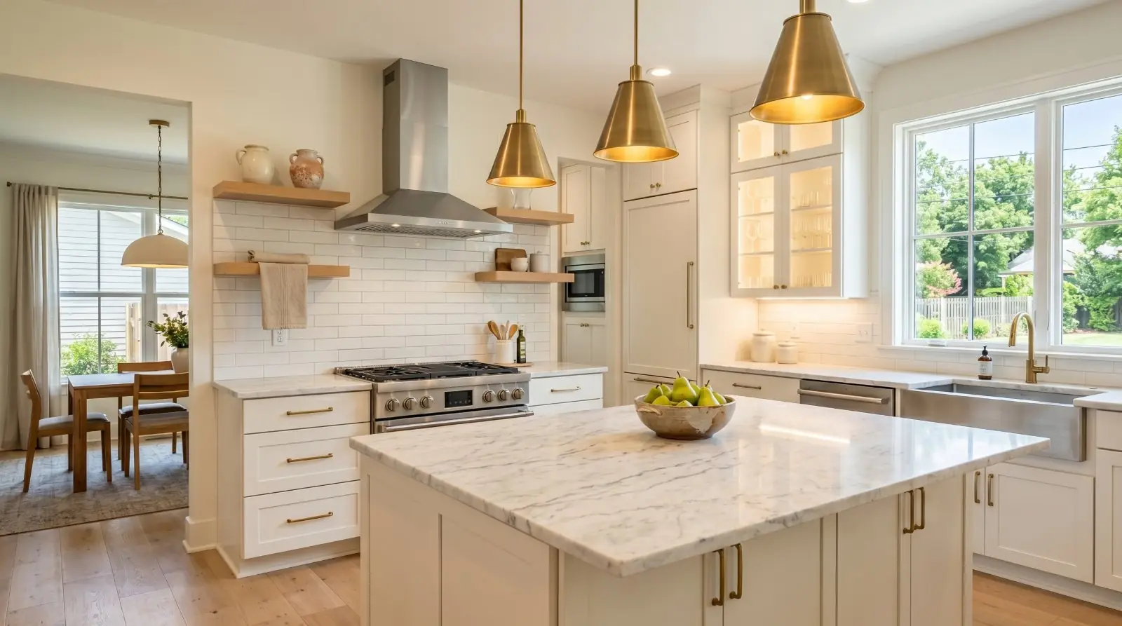
Shot 1 — The wide hero
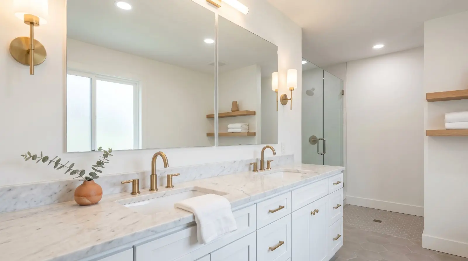
The single most important kitchen photo in the gallery. The job of this shot is to show the room as a whole and to give the buyer a sense of how it lives.
Stand in the corner farthest from the main work zone — the range or the sink. Drop your phone to chest height (roughly 48–54 inches from the floor). Shoot wide.
Why the corner: standing in the doorway shows a wall. Standing in the corner shows depth. The eye reads the room as larger because there’s a foreground, a middle ground, and a background — the visual structure of a space that feels generous.
Why chest height: shooting from eye-level pushes ceilings down and pulls the floor up. Chest-height widens the room and makes the ceiling read taller, which is what every buyer is looking for whether they know it or not. A mini-tripod helps lock this height consistently if you’re doing more than one listing a week.
The wide hero should answer six questions in a single frame. Check the framing on the screen before you press the shutter:
- Where is the sink?
- Where is the range or cooktop?
- Where is the refrigerator?
- Is there an island, and how much counter space does the kitchen have?
- Is the kitchen open to the living or dining area?
- Is there natural light?
If the wide hero can’t answer those questions clearly, the framing is wrong. Try a different corner or a different distance. A buyer looking at this single photo should be able to read the kitchen’s layout in two seconds.
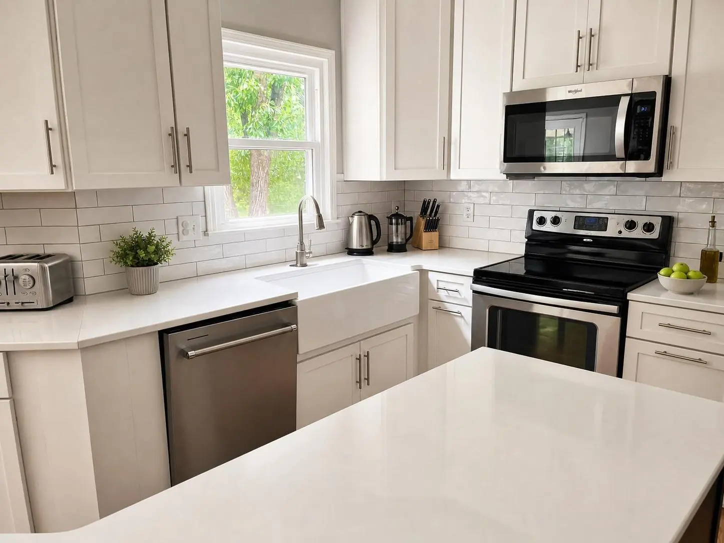
Shot 2 — The work-zone detail
The mid-distance shot that anchors the kitchen as a working space. The island, the range, or the sink — whichever is the kitchen’s strongest feature.
Stand at a three-quarter angle, not straight on. The depth of the countertop should run away from you, not flat across the frame. A flat-on island photo reads as a kitchen-supply catalogue page. A three-quarter angle reads as a room.
Include a foreground anchor — the corner of the island, the edge of a counter, a stool seat. Empty foregrounds read as small and flat. A foreground element gives the eye something to register before it moves into the room.
The work zone is also where staging shows up. One intentional item — a small bowl of lemons, a French press, a board with a teakettle on it — keeps the kitchen from looking sterile without crossing into cluttered. The cookie jar stays. The dishrack does not.
Shot 3 — The connection shot
The shot that ties the kitchen into the rest of the floor plan. If the kitchen opens to a living or dining space, this is the photo that tells the buyer the room is part of a larger story. Two variants are worth knowing:
Kitchen-out. Stand in the kitchen, looking outward into the adjacent room. Include enough of the kitchen in the foreground (a counter edge, a cabinet corner) that the photo reads as kitchen-into-living. The transition is the point.
Reverse angle (room-back). Stand in the adjacent room — the breakfast nook, the dining area, the living space — and shoot back into the kitchen. The kitchen appears framed by the doorway or the opening, with the adjacent room’s furniture (a chair edge, a dining table corner) anchoring the foreground. This is the angle that makes an open-plan kitchen feel genuinely connected to the rest of the home, rather than just adjacent to it.
For most kitchens, one of these two angles is enough. For especially strong open-plan layouts, both can earn slots in the gallery. If the kitchen is closed off from the rest of the floor plan, skip both. Don’t manufacture a connection that isn’t there.
Every light on. Every time.
The single cheapest upgrade in real-estate photography is turning on every light in the room before you press the shutter.
Every overhead. Every pendant. Every under-cabinet strip. The closet light, if the pantry door is open in the frame. The hood light over the range. The light in the microwave if the microwave door is glass. Every one.
Phone cameras struggle with the dynamic range that kitchens punish them with — bright windows, dark cabinetry, mid-tone counters — and the camera’s auto-exposure averages everything out, leaving shadows muddy and highlights blown. Interior light fills the shadows the camera can’t recover. The kitchen reads warmer, brighter, and more inviting on the camera sensor than it does in real life, which is exactly what you want.
This is not a workaround. It’s the standard. Pro real-estate photographers do it. The kitchen owner does it for showings. You do it for the photos.
The colour-temperature trap
One specific problem kitchens face more than any other room: mixed colour temperature. Window light is cool (around 5500–6500K, depending on the time of day). Most interior fixtures are warm (incandescent bulbs at 2700K, halogen at 3000K). When both light a kitchen at once, the camera averages them and the result is a photo where the cabinets look slightly dirty, the counters look slightly green, and the white tile looks slightly yellow. The buyer can’t articulate what’s wrong, but the kitchen reads as off.
Two fixes:
- Tap to set white balance on a neutral surface in the area most lit by your dominant light source. If the daylight is dominant, tap on a white surface near the window. If the interior fixtures are dominant, tap on a counter or wall surface lit by the lamps. The phone calibrates the rest of the image to that reference.
- Replace mismatched bulbs before the shoot. 5000K daylight LED bulbs in every fixture in the kitchen — bought from any hardware store for about $5 each — eliminate the mixed-temperature problem entirely. The seller swaps them in, you shoot, the seller swaps them out if they prefer warmer light for daily living.
The window problem, and the exposure-lock fix
Almost every kitchen has the same problem: a window or a sliding glass door that’s much brighter than the rest of the room. The phone’s auto-exposure either blows out the window (so you can’t see the view) or crushes the interior (so the kitchen reads as a cave). The fix takes two seconds.
On an iPhone, open the camera, frame the shot, and tap and hold on the brightest area of the frame — usually the window itself or the counter directly below it. A yellow box appears with AE/AF LOCK at the top. The phone locks the exposure to that brightness level. The window stays exposed correctly, the camera stops trying to brighten the dark side of the room, and the interior light you turned on (because you turned every light on) fills in the shadows.
Then recompose, take the shot, and tap once to release the lock.
On a Pixel or recent Android, the equivalent is tapping the brightest spot to set focus, then using the exposure slider that appears to drag the exposure down until the window detail returns. Same principle, slightly different gesture.
The exposure-lock trick is the difference between a flat, blown-out kitchen photo and one that reads as the room actually looks. It is, by some margin, the most important camera technique any agent will ever learn for interior photography.
What to put in the frame — and what to leave out
A clean, intentional kitchen photo is mostly subtraction. The room you want in the frame is the room minus the daily life. Before you shoot, walk the kitchen once with the eyes of the buyer scrolling Zillow at 11pm.
The rule is intent. Every object in the frame should be there because you chose it, not because it was there when you walked in.
Use scale objects, not clutter, to communicate size
A subtle distinction worth getting right: a kitchen photo communicates scale (how big the room is) through reference objects in the frame. The instinct is to leave countertop appliances in to show the kitchen is “lived-in.” That instinct is wrong — countertop appliances signal clutter before they signal scale, and a cluttered kitchen reads as smaller, not larger.
The reference objects that communicate scale honestly:
- Bar stools at the island. Three stools at an island visually reads “this island is large enough for three people to sit at.” Two is fine. One reads as token. Four or more in a small kitchen reads as crowded.
- Pendant lights over the island. They tell the buyer the island is large enough to anchor a defined zone.
- A breakfast table or bench in the eat-in area. Defines the eat-in space as functional.
- An island itself, photographed in relation to the rest of the kitchen. The wide hero shot’s job.
Use bar stools, pendant lights, the island itself. Take everything else off the counter.
Occupied versus vacant kitchens
The shoot differs based on whether the property is currently lived in:
Occupied kitchens need aggressive depersonalization. The seller lives there; the photo doesn’t include that fact. Strip the fridge, remove every countertop appliance, hide the trash bin, take family photos off the windowsill, put the dog bowl in a closet. The seller may resist some of this — the dish rack feels permanent to them — but the photo’s job overrides the daily-living convenience.
Vacant kitchens have the opposite problem: they read as cold and abandoned without light staging. A few intentional items make the kitchen feel like a home, not a showroom. A small bowl of citrus on the island. A folded white tea towel over the oven handle. A single wooden cutting board leaned against the backsplash. One stem of greenery in a clear vase. Nothing else.
For vacant listings where the kitchen is genuinely empty and the seller can’t provide any staging items, the photo can still work — but the framing matters more. A tighter shot on the work zone (without the empty island in the foreground) often beats the wide hero in a fully empty kitchen.
Matching the styling to the listing tier
Kitchen styling expectations shift significantly by price point. Under-styling a luxury kitchen reads as cheap; over-styling a starter home reads as overselling. The buyer in each segment has calibrated their expectations from the listings they’ve already seen in their price band — the photo needs to slot into the same register.
Affordable / starter kitchens (typically under $400K)
The job: communicate clean, functional, and well-maintained. Not aspirational. Counters bare beyond one intentional styling item. Skip premium-looking styling props (no fresh-cut flowers in a crystal vase, no wine bottles in a curated row) — these read as aspirational and the buyer feels the kitchen is being oversold. A bowl of citrus, a single folded towel, a clean cutting board against the backsplash. That’s the staging budget.
Don’t fight the kitchen. If it’s a builder-grade kitchen from 2012, photograph it as a clean and well-cared-for builder-grade kitchen from 2012. The buyer in this segment values honesty over polish.
Mid-market kitchens ($400K–$1M)
The recommendations throughout this article apply unmodified. Three shots, intentional styling, every light on, the wide hero from the corner. This is the segment most kitchens fall into; treat it as the default.
Luxury kitchens ($1M+, definitively $1.5M+)
The job: communicate craft, finish, and the lifestyle the kitchen enables. More styling, but more restrained styling. A luxury kitchen photo with cluttered counters reads as a mid-market kitchen, no matter what the materials cost.
Detail shots earn more slots in the gallery. A wide hero, a work-zone detail, a connection shot, plus 2–3 feature shots (the range, the island, the pantry door, the wine fridge, the cabinetry detail) is the right density. Lighting matters more, not less. Mixed colour temperature kills a luxury kitchen photo faster than any other tier. Restraint matters more, not less. Over-HDR, over-saturated, or aggressively-cleaned-up rendering reads as cheap at this tier. Twilight or evening-mood shots can earn a slot in the gallery for kitchens with strong pendant lighting and integrated under-cabinet light. Same disclosure rules apply.
The order to shoot
Once you’ve cleared the counters and turned every light on, the shooting itself takes ten minutes. The order matters.
- Wide hero first. This is the shot you’re going to live or die by. Shoot it three times, slightly different positions in the corner, slightly different heights.
- Work-zone detail. Two or three angles on the kitchen’s strongest feature.
- Connection shot. One of the two variants (kitchen-out or reverse angle), maybe both for a strong open-plan layout.
- Two or three “if it’s good” extras. Bonus shots — they don’t earn a spot in the gallery if they don’t carry weight.
The “if it’s good” feature inventory
What to capture as a detail shot when the kitchen has it:
- — A high-end range or cooktop (gas, induction, pro-style from Wolf, Viking, La Cornue) — straight-on or slight three-quarter angle, hood on if the hood is a feature.
- — A statement backsplash (slab marble, zellige tile, custom millwork) — tight shot from a low angle, every light on.
- — Pendant lighting over the island — angle that includes the island below and the lights as a styled cluster.
- — A farmhouse or apron-front sink — three-quarter angle, no dishes, faucet clean, light filling the basin.
- — An integrated or premium appliance suite (Sub-Zero panels matching cabinetry, Miele built-ins, integrated dishwasher fronts).
- — A walk-in pantry — door open, organized, every shelf-light on, the kind of shot that telegraphs storage.
- — A coffee bar or beverage zone — staged but minimal, espresso machine clean, no random mugs.
- — A wine fridge or wet bar — tight shot, glassware staged sparingly.
- — Custom millwork (glass-front uppers, painted cabinetry with visible craftsmanship, integrated banquette seating).
- — A breakfast nook or eat-in space — its own composition if the space is distinct from the main kitchen.
Each one earns a slot only if it’s genuinely a selling feature. A standard stainless dishwasher doesn’t earn a shot. An integrated Miele dishwasher in a luxury kitchen might.
Total time on-site for the kitchen: 12–15 minutes for a mid-market kitchen, 25–35 for a luxury kitchen with multiple detail shots. Total shots taken: 15–25 for mid-market, 30–50 for luxury. Total shots that make the gallery: 3 for mid-market, 5–7 for luxury. The cull is the work.
When the phone isn’t enough
Most kitchens, in most light, can be shot to MLS-grade quality with a recent iPhone or Pixel. The exceptions:
- Very dark kitchens with little natural light and dim interior fixtures. The phone sensor will give you noise instead of detail. The fix: a $30 mini-tripod and a slower shutter, or scheduling the shoot for late morning when the natural light is at its strongest.
- Very small kitchens where even the ultra-wide setting can’t fit the room without distortion. The fix: tighter shots that don’t try to capture the whole room in one frame. Two or three medium shots can tell the kitchen’s story without forcing the wide angle to do work it can’t.
- Kitchens with extreme contrast (massive south-facing windows, dark cabinetry). The fix: the exposure-lock trick gets you most of the way. The post-shoot brightness-and-shadow balance gets you the rest.
The before-and-after
Two photos of the same kitchen, on the same afternoon, by the same agent. The first one is what most listings get. The second one is what this article is about.
The difference: where you stood, how high you held the phone, every light on, and one tap-and-hold to lock the exposure. That’s it. Same kitchen, same camera, ten extra minutes.
The kitchen sells the listing. Make the kitchen photo do its work.
Phone photos to market-ready listing images in 10 seconds. Twenty free when you sign up — no credit card.
One photo tip every Sunday.
Real techniques agents are using this week. No spam. Unsubscribe in one click.